Light Frog

Something I'm working on for a tutorial about placement of lights.  I don't know yet whether the tutorial will make it onto the internet, but I can at least show the art.

Lights and Shadow

I added a new post on The Art Center blog.  What I left out there was how to apply light sources to get the effects you want.  This is just an overview, but I'll probably go more into depth on it if I ever write that blasted book.

Diffuse light sources are the most common and useful lights in painting. They make great fill lights, rim lights, and key lights, they always make subjects look appealing.  They tend to soften features and are good for creating a pensive emotional response when used as key lights.  Light reflected from "lambert surfaces" always fits into this category.


I didn't have time to paint examples and the great masters are better at it, so instead here's Edmund Blair Leighton above, using a bright overcast sky to support the gentleness of the scene.  William Bouguereau's painting below that uses the common "north light" from a window to soften the girl's features and emphasize her beauty.

Direct or spot lights have a strong visual impact and are useful for creating drama or tension.  You can mix the effects of direct light sources with the effect of diffuse light sources by using light sources that are somewhere in between.  Here's a great example from Paul Delaroche of the drama created by a direct light source.  Below that, Edmund Blair Leighton shows how a diffuse light can have some of the dramatic effect of a direct light, in this case by using a large window but positioning it some distance behind the subject.
Remember that spot lights are really just direct sources with something "off camera" casting a shadow, so the light beam has a specific shape to it.  This shape doesn't always have a hard edge, a great example being sunlight blocked by soft-edged clouds (see Albert Bierstadt example below, on the rocks).  So you can also mix the softening effects and gradients you'd get from a diffuse source with the hard shadows of a direct source.


Finally, nearby light sources are the most dramatic of all, but they can also be distracting if too strong or used too often, because of the visual tension they create.  I also forgot to explain another thing about them on the other site, so I'll post it here instead.

theartcenter.blogspot.com

The other day I was upset when I found a blog that stated that my art was a blend of 3d renders and painting.  I felt like Ned Nederlander when he was accused of using camera tricks to make his fast draw appear faster.  I guess I've occasionally used 3d to cheat my way out of having to work out the perspective on a spaceship, so does that make the accusing blogger correct?

Speaking of using 3d to cheat, I've been invited to contribute to a new sister blog to Randall Sly's excellent Character Design blog (link in my sidebar), The Art Center.
Here's a preview from my first post there (the aforementioned cheating used to render the spheres.  I'm not going to waste an hour or two breaking a sphere down into planes):
And don't worry, I'll continue my art thinking/learning posts here---I'll probably focus on digital painting stuff there and spew all my other thoughts here.  Or maybe I'll post the same in both places.  I guess we'll see how it works out.

Thank you, Mr. Kim

I'm thankful that I get to work with people who are awesome.

One of my coworkers, Jason Kim, has a great eye for appeal and design, and he spent about 20 minutes helping me out by drawing over my design.  He always notices seemingly insignificant things that in the end make a drawing much stronger.  Click the image below for an animation showing the transition from my original drawing (blue) to his fixes (red) to see what I'm talking about.
Just for the record, Jason suggested that I put some feet poking out of the end of the dress, a suggestion I ignored for reasons I'll explain later.  So if it looks funny without them, that's my fault.

Speaking of which, do you ever wish that people gave more critiques on art blogs instead of just digital high-fives?  I used to go to some art forums and I liked the positive criticism and exchange of ideas there.  But I understand why it's not the same with blogger---it's missing is the constancy of conversation threads, where it's easy to keep track of dialogue you're interested in (and interesting comments don't quickly get swept away by new posts).  Maybe someday someone will come up with a hybrid solution that can satisfy both needs.

Creativity, Expression, Education, and "The Dip"

Based on things I've read and seen (ie. just a hyphothesis), I believe there's a big dip in creativity as artists increase in learning.  I think this is one source of the common (but mistaken) idea that education inhibits creativity---because most people and artists stop actively learning about their craft before they reach their creative and expressive potential.

This graph illustrates my hypothesis that after the big dip, if an artist continues learning, comes a leap in creativity and expressive ability.  The key to reaching that point is pressing through the dip and not assuming that you already know enough.
Image Credits: Some kids, a Disney Artist I couldn't track down, Frank Lloyd Wright, Luc Desmarchelier
I separated expression and creativity because I think expressive ability never takes a dip, but it is accelerated as creative ability is unlocked.

Also keep in mind that this is all learning, not just learning construction---although construction is still the foundation for expressive learning.  This graph doesn't represent any particular period of time, and can actually happen multiple times over an artist's development (ever experience art depression?  You're probably at the bottom of the curve and just need to press forward and try to learn more.)  An artist can also simultaneously be in different stages of the graph for different abilities---e.g. very creative architecturally but not as creative in designing creatures. 

Also, I put in the red graph for anyone who happens to be amazing and never experienced a dip.  You are awesome, and you really shouldn't waste time reading my blog.  Unless you are part of that elite group of people who are still in the dip but don't realize it (we all know one or two).

Thoughts on Construction and Expression, Part 1


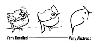
Looking at the concept art world shows multiple "schools" of concept art with completely different goals and opinions about appeal.  These differences can be boiled down to a struggle of two artistic forces: construction and expression. 

Construction is like rhetoric, and appeals to audiences through accuracy of description.  Expression appeals to audiences through purity of design, emotion, or ideas.  Construction can be devoid of expression, and expression can override the need for accuracy.
Every school of art uses some combination of construction and expression, but great artists recognize that expressive elements connect with audiences in ways that crude construction can't.  But my point isn't to prove that expression is better than construction.  In fact, without construction there can be no expression.  The reason why Acadamia has difficulty producing good artists lately is because most schools have rejected construction-focused education and focus almost exclusively on expression, leaving artists without the tools necessary for powerful expression.

Rendering this monster's arm with a few expressive lines took some thought, and relied on years of studying anatomy and how to use line to describe form.


Remember though that construction covers a lot of areas of learning, so anatomy and technique won't guarantee expressive ability.  The first image shows that a basic knowledge of anatomy applied randomly can result in a hodgepodge of shapes and form changes that aren't terribly appealing.  The second image is a lot more clean, fits the wound-up personality of the monster, and has an appealing interplay of shapes and forms that compliment the overall design.  These design decisions relied on constructive elements of design being applied to other constructive elements of anatomy and form in a harmonious way.


One last story to make my point.  The other day I was trying to draw people and I couldn't get the hands to feel natural.  I could imagine what I wanted, but even when I looked to my own hands for reference what came out was awkward.  I suddenly realized that I've been coasting for years on a rudimentary knowledge of hands; I'd learned to fake things so well that I'd overlooked some important education.  So I pulled out Bridgeman's Constructive Anatomy, spent an hour studying the forms comprising the hand, then attempted my drawing again.  That time it came out the way I wanted.  Now I've resolved to keep studying hands until I can express what's in my imagination effortlessly.

The moral of the story is: if you're struggling to find expression in your art, your problem might stem from gaps in your knowledge of construction.  There is also another roadblock to expression that I'll talk about in a later post.

Abstraction

I run into a lot of people that don't understand the difference between abstraction and caricature.  Maybe that's because the meaning of the words has become muddy in common usage.  Artists in general would be better off if everyone was clear on the terms, though, because while abstraction and caricature are related concepts, they are problems that have to be addressed individually.

My definition of each is:
Caricature=Distortion and exaggeration of a subject's distinctive features
Abstraction=Simplification down to a subject's essential features, eliminating unnecessary information

Abstraction is one expression of a design principle called Signal-to-Noise Ratio, which states that the Signal is any information that is important for the viewer, while Noise is unimportant information which necessarily interferes with the signal

The key in any good design is to identify how much of the detail is actually signal, and downplay/subdue/eliminate everything else.  In other words, not all detail is noise---sometimes it's part of the signal.  The best way to judge whether a detail is signal or noise is:
- Does it say something important about the character?
- Does it enhance the overall style of the piece/property? (ie. Does it say something about the world?)
- Does it significantly increase the character's appeal to my intended audience?
- Will the audience be able to see/appreciate the detail or is it just adding clutter to the scene?
If the answer is no to all four, tone it down or cut it out!

So the level of abstraction in a subject is just an expression of the signal-to-noise ratio.  I usually have to consciously abstract things after my first designs, and I often don't go far enough.  I've seen other artists who have the opposite problem and simplify things so far that they lose their connection to their audience.  I think that's why it's a ratio and not a hard and fast rule; too little is too little, and too much is too much.
With this Goldcrest, at first glimpse it may seem I didn't abstract things at all, just used caricature to push the personality and distinctive features.  But while I wanted people to react to it as a real bird, the details themselves could become distracting really fast.  So I used tricks like alignment, color, shape juxtaposition, and contrast control to keep the eye focused only on what was important.  Of course, after doing the little abstraction example above I wanted to go back and simplify about 10 more things in this image, so I'm obviously still learning this principle.

Mourning Dove

I always thought they were Morning Doves, but apparently they're more sad.  Maybe they ARE Morning Doves but they're just not morning people.

I keep trying to write a Tip-of-the-Day style post, but it's taking more time than I expected.  Stay tuned.

iPhone Art Book! And another bird.

Thanks to Bobby Chiu and others at Imaginism Studios, some of my work is now an iphone app.
You can find it here!   http://www.artistsketchbooks.com/

I will be giving out five promotional copies---if you want one, comment on this post and in three days (Saturday) I will pick five comments at random for a free app for your iPod Touch or iPhone.

The app/book includes hi-res versions of work I've put on the blog, as well as some updated and finished pieces never seen before.

Bird number two:

Resolution

I'll be honest:  I am not likely to finish the book I resolved to write.  At least not anytime soon.  However, after watching Marcelo Vignali's inspiring interview, I decided that I shouldn't wait for that opportune time to share what I'm learning.  So I'm going to revive an old feature of this blog and post the discoveries I make as I evolve as an artist.

I still plan to write a book once I've got some of the gaps filled in my own knowledge, but hopefully this will do until then.

My other resolution is to start working on more personal art, specifically art that I can use to illustrate points in the book.  This image is part of a series of birds I'll use in the character design section of the book.

Thanks everyone for reading and Happy New Year!

Lessons Learned

I did this for a children's magazine published by the LDS church.  I'm also a member of the church, but that's not why they hired me for the article.  That credit goes to Natalie Malan for sending a letter of recommendation to their art directors on my behalf (Thanks Natalie!).  They hire a lot of very talented artists, so I'm honored to be included.

I learned some useful tidbits doing this, and I pass that knowledge on to you:
  • If nobody complains about your unrealistic, made-up lighting, just run with it
  • Bright pinkish-purple subtleties do not convert well into CMYK.  Experts conclude that you have to paint the colors and values more carefully so they will convert correctly.  I conclude that I'm going to avoid that end of the spectrum entirely next time.
  • If the borders of your painting are boring enough, your art director will never notice that you didn't include bleed for the edge of the page
  • If your wife has a baby due around the time your art is due, it's probably better to finish it early than to take a 3-week hiatus and then sloppily finish at the last second.