Since most of my artwork these days is stuff I can't post, I'm thinking of doing a series of posts instead where I condense down the workshop I did at LAAFA on Painting and Design. Will any of you out there read it if I do?
Environment
Considering how much I love doing environments, it's strange that I don't do them more often. They do take a lot of time and they never turn out as good as I imagined, so maybe that's why.
I started this one for fun, then decided to keep the riverbed dry so I could use it as a base for one of the Schoolism assignments (the one on water and liquid, I'm having students paint water into the scene).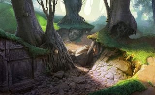
The Secret Life of Ms. Finkleman

I just noticed the a book I did a cover for last year has been released! Working with Harper Collins was fun. Probably the hardest part for me was hitting the right look for the target audience, as I don't exactly have a thumb on the pulse of the "tween" fiction market. So I just went for something more realistic than my usual, but that still had some fun and imagination to it. In retrospect I should have hired some models instead of trying to work out of my head, but I still wouldn't want to lose that that slightly skewed, almost carictured look.
I read an early draft of the book before starting the illustration, and I enjoyed it in spite of my out-of-touch-ness. If you want a copy, you can see it here.
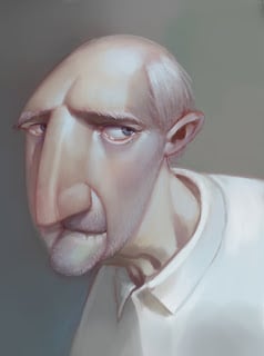
Drawing Session
I think this one was around 70-80 minutes. I didn't do a good job with the likeness, but I'm happy with everything else.

Lines
Here's some line art I did recently for the students of my BYU class. I'm trying to give us more time for painting, so we're not spending as much time critiquing and fixing drawing issues. We'll see after this semester whether it turns out to be a good idea or not.
I haven't had time to clean up the lines very well yet, and there are a couple more characters I'll post after I've fixed a few more things. It's possible we'll just spend the whole semester fixing my mistakes instead!


I haven't had time to clean up the lines very well yet, and there are a couple more characters I'll post after I've fixed a few more things. It's possible we'll just spend the whole semester fixing my mistakes instead!
Wind Rider
This was for another lunch project. The assignment on this one was flat black and white values, minimal line work.
It didn't take that long, but it was a really good design exercise.

It didn't take that long, but it was a really good design exercise.
Yellow or blue
Some of the people I work with are doing "lunch projects," where we use whatever time we don't spend eating during the lunch hour working on an assignment. I won't post mine every week, because it's mostly an educational exercise, but occasionally something good might come out of it. This week's assignment was to do something based off a palette from a Gustav Klimt painting. 
Schoolism Class: Advanced Lighting
There are already a lot of other online tutorials on lighting and surface. Not only that, but Schoolism has some amazing artists and instructors. Because of this, I felt pretty intimidated when I was asked to teach a class for Schoolism. I wasn't sure what I could bring to the table that would be on par with their other classes and worth the investment compared to similar offerings elsewhere.
However, after doing some work on the course I can say with confidence that this class is going to be awesome (if you don't mind my awkward way with words in the lectures). I've done enormous amounts of research and boiled it all down in a way that anyone should be able to understand. I'm excited to teach when the class starts up next month. The part I'm looking forward to most is the interaction with students on the assignments, because that's where most of the learning is going to happen.
I did this as a demo from the lecture on "fleshy" materials.
Troll-ish

Something from Friday's drawing session
For some reason I liked this painting a lot better on Friday. Now something seems off about it. Maybe I didn't push the exaggeration enough. Hmmm.

Book for Comic Con
I'm attending ComicCon for the first time this year, so I thought I'd better produce my first art book also. It's filled with almost 80 pages of paintings and drawings, including old art, new art, and updated art. I only printed 20 copies and I won't have a booth, so if you're interested you'll have to (A.) Go to comic-con, (B.) track me down, (C.) be one of the first 20 people to do so, and (D.) Have $30.

I will, however, be doing demonstrations at the Schoolism and LAAFA booths, so if you're wondering where to find me, I'll post a schedule of when I'll be at each booth soon.
Here's a cropped sample from one of the new images in the book:
Here's a cropped sample from one of the new images in the book:
Hope to see some of you there!
Beak Mountain update
I haven't had much time recently to work on my own projects, but I want to thank everyone who gave critiques on the mountain picture. Here's a progress shot to show that I'm attempting to address the various problems that many of you pointed out. I haven't gotten to everything yet, so don't worry too much if you see something awry still. For those who suggested that it needs a story, you're right (Curses! Why do I never think of basic rules like that until I'm deep into the painting phase?). Still, I don't feel too bad since that wasn't the point of the piece; it will still work just fine as the painting process tutorial I wanted to make.
 In other mountain-related news, I took my family up into a nearby canyon (about 30 minutes from my house) for a campfire/picnic last night. Here's one of the views we had from our campground---although a photo doesn't give a very good idea of how impressive these mountains really are in person.
 Also, if you haven't ever had wood-roasted hot dogs and s'mores, you need to find a way to make it happen. Even if that means setting a fire in a dumpster and cooking before the fire department arrives [common sense alert for anyone who has none: DO NOT REALLY FOLLOW SAM'S ADVICE.] (<---Actually, this is not a bad mantra to live by).
Costume designs
I've been sketching with pencil and paper a lot more lately, and trying to get some of the rust off. Unfortunately, I'm not confident enough yet to break the inks out, so these were inked and colored digitally.


As a side note, I've noticed that it's very difficult to design costumes that look good regardless of what the character is doing. Still, I've found I get the best results with a fairly straightforward stance pose.
Shadows
Did this for a Liahona article. The printed version I saw had different colors and lots of pixelation, so I don't know what went wrong (probably something on my end). At any rate, now you can see what it was meant to look like:

Work-in-Progress
Something I'm working on, but I'm unhappy with something I can't quite put my finger on. Any suggestions/critiques? 
Book Cover
A cover I did for a German publishing company. The book is a compilation of two previously published books by A. Lee Martinez. 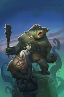
Old man and tablet
I use an old Intuos 2 at home and the pen is falling apart. I hate it. I'm counting the number of times that the button falls off and the sleeve falls down before I get fed up enough to spend money on either A) a new pen or B) a new tablet altogether. I hate to spend $70 on a stupid pen, but I'm having an equally hard time justifying the much larger expense of the tablet.
I do like the Intuos 4 though. I spent about 10 minutes scratching out this color sketch on a coworker's new intuos 4, and then spent another 20 minutes polishing it up on my rickety tablet at home. The quality difference between the two was pretty big, but I have to weigh that factor against how cheap I am. So at least for now, cheapness wins.
I do like the Intuos 4 though. I spent about 10 minutes scratching out this color sketch on a coworker's new intuos 4, and then spent another 20 minutes polishing it up on my rickety tablet at home. The quality difference between the two was pretty big, but I have to weigh that factor against how cheap I am. So at least for now, cheapness wins.
Orangutans and Character Design


Armed with this knowledge, I decided to attack the problem again. The lower left guy (image below) is where I started after doing some research on orangutans. When I started to think about character types that fit with orangutans, my first thought was stereotypical surfers/hippies. Then it hit me: Orangutans are the rednecks of the primate world. So I did some more brainstorming and came up with a more specific personality/role that I liked for this orangutan. My top drawings are starting to go somewhere. If I was doing this character design for work I'd probably do about 20 more iterations to improve the idea and replace (where possible) stereotypical elements with more surprising ideas that filled the same purpose. I already think the new guy (upper left) is a big improvement on the original, though.

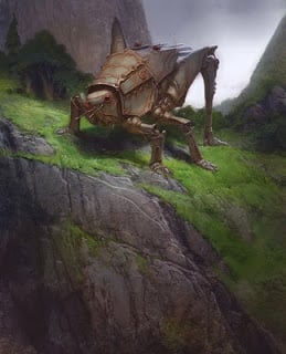
Tetrigid Tank
Something for the Avalanche blog. Joe Olson came up with the topic. Honestly, at first it didn't really inspire me, but after mulling over the idea this idea popped into my head. That's the great thing about committing yourself to do art based on topics---trying to find an interesting take on a topic that isn't (at first) interesting to you is a healthy challenge for your creativity. I also like the idea of taking the challenge seriously and making it into a portfolio piece. Although I do wish I'd spend a little more time on the bug's design before starting the painting. The details are cool, but the overall structure is basically a regular old grasshopper.
Brush work
Here's the original drawing I did of the grumpy jedi before Jason Kim helped me fix the drawing. Jason's suggestions made for a much better drawing, but I still think I slightly prefer the original character design.
 In case you're curious about what brush I used, I just did a brush tutorial over on the art center blog. This means that I will be as grumpy as this guy if I get any more people asking me what brushes I use.