The Art of the Heist

Some people misunderstood the intent of my last post.  It was certainly condescending toward the "thieving" artist. But it was not in a sanctimonious-dean-accusing-a-student-of-plagiarism way, but in an experienced-thief-shaking-his-head-at-the-burglar-caught-by-leaving-tracks-in-the-snow kind of way.

Because let's face it: all artists are thieves, if you count being influenced by images or ideas that you didn't create as stealing*.  So it's not "good artists borrow and great artists steal"; it's good artists clumsily pick-pocket, and great artists pull off the heist of the century.  Great artists steal in ways that are either untraceable or in ways that are so masterful that nobody cares where it all came from.

So while I'm not one of the all-time great plunderers, for the sake of other bungling burglars out there I'd like to share the ways I've learned that you can steal and still "get away with it."

The Lookie Loo
Otherwise known as "using reference," this is the most fundamental grab-and-run operation.  It consists of drawing or painting something that already exists, usually while the artist is looking directly at that thing.  Sometimes the artist will set up a scene and then pilfer it verbatim, but other times he or she will pinch from smaller photos or art that describe the individual elements needed for the larger piece.

The Memory Game
Similar to the Lookie Loo, but in this case the artist steals imagery or ideas from things he or she has seen or been inspired by in the past.  The beauty of this ploy is that the artist may perform the theft without even realizing it is happening.  In order to avoid a surprise outcome with the Memory Game, artists may intentionally throw in a Combination Caper or layer in a Romance Scam to throw people off the scent.


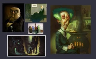
The Combination Caper
Here the artist lifts multiple ideas from different sources and fuses them together. The success of this caper relies on constructing an image from things the audience is already familiar with, so that they will subconsciously register each contribution as it influences their reaction to the piece.
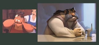

The Parrot Ruse
Otherwise known as "quoting," in the Parrot Ruse the artist repeats a recognizable portion of another artists' work in order to establish context for his own message.  By calling upon the viewers' familiarity with the work being quoted, the artist suckers them into thinking that his wholesale rip-off is acceptable because "it's ironic."  The non-art equivalent to this would be stealing a Lambourghini in broad daylight while singing.  Not only would people allow it: they would applaud afterward, assuming the theft was a clever part of a flash-mob.


The Romance Scam
Sure, the artist's character design isn't that original.  But when everyone is looking at the way she's handled the lighting, or the emotional expression of the piece, most people don't even think about the design.  The Romance scam works by misdirection---the artist hides her fraud in one area with fancy execution in another.


I'm pretty sure I didn't paint all these textures from scratch
Salting the Line
This is one case in which an artist can get away with taking other art or photos directly, if it is done carefully.  By layering in textures, patterns, or other effects from another source, the artist can quickly add polish and something interesting to his piece.  This type of cheat only works when nobody recognizes the source being used, or if some combination of the sources creates an effect that masks the individuality of the plundered pieces.

The Chop Shop
Think of it as a collage of crime.  This one is commonly used by digital matte painters, who need to create a sense of realism, but do not have the time or inclination to paint in every leaf on every tree.  In order to pull off a Chop Shop successfully, the artist has to know something about composition and how to get things to fit together.  The artist's primary goal in a Chop Shop job is assembling his ill-gotten goods in an appealing way.
 
 
Scams that Don't Work (Anymore)

The Pablo Pipoppycock
Don't have any original ideas?  Just vandalize one of your lifted ideas with some crazy effect and call it "modern."  This lowbrow version of the Romance Scam appeals to people's fear of being considered less intelligent than others.  Just be aware that, even if your lengthy essay explaining the piece impresses your art school buddies, you can't expect to win any points in accomplished art crook circles.  It's a small-time scam and we've all tried it at least once, but the real satisfaction is found in bigger heists.
 
The Snake Oil Swindle
Selling a product made by someone else as your own?  We all know that direct copies and studies have value to you personally, but don't try to profit from them unless your big dreams as an artist include being blackballed by at least a corner of the industry.
 
The Flemish Prisoner
This is when the artist decides that, since nothing is original anyway, he or she will just paint the same boring things as everyone else and not ever even attempt to have an original thought.  Mastering a technique, but not developing the ideas beyond stage one, is just a waste of potential.

*Disclaimer: I'm not condoning actual art theft, of the literal or figurative variety.  In fact, I don't believe artists are thieves any more than I believe that artists are accountants.  I DO believe in relaxing a little and appreciating the fact that all artists are standing on the shoulders of giants.  Please don't begrudge another artist if they are standing on your shoulders; because you've enjoyed the same courtesy from other artists around the world and throughout history.

"Good artists borrow, great artists steal"

Even if Picasso or T.S. Eliot really said that, I'm pretty sure that this is not what he meant:

Something I painted a few years ago

Art from a recently released game called Tiny Bang Story

I'm still not sure how to react.  On the one hand, the artist borrowed heavily from my art without credit or recompense.  But on the other hand, they made it look like that.  I should probably feel more bad for the culprit than anything.  Not bad enough, however, to spare him or her the public ridicule he or she rightly deserves.

Update:  Joe Olson points out that the kid in the image (including the hand on the shoulder, but not his eyes) appears to be modified from a picture by Kevin Keele.  It's very strange---the rest of the art in the game looks pretty good and the artist here obviously re-painted everything him/herself.  So why do such an ugly hack-job on this portrait?

Lord McCaw

This was for an exercise I did with some of the other concept artists.  We were supposed to take an animal, find an appropriate personality, and push the caricature a bit.  I want to do another where I push the caricature further, but I was happy with it anyway, considering I did the whole thing in an hour.

Weak

As a kid, I loved Superman. But now he's so boring to me. Maybe it's that he can do everything. Maybe it's that he acts like "the ring is so heavy" Elijah Wood whenever fake green rocks show up. Or it might just be that in order to balance out all his power, writers seem to love making him unsure of himself. Uncertainty doesn't necessarily make a character appealing. It just makes you frustrated with him, like you always are with Hamlet.  And let's face it, Hamlet would have been way less interesting if they made him sword-proof.

Gestalt

Gestalt psychology is an important concept for artists, and it's one way that the struggle of order and chaos is part of good design.  The Gestalt effect is also built into everyone, so you can expect audiences to respond exactly the same, regardless of age, gender, or culture.

Gestalt psychology is about how we sort the complicated mass of information our eyes (and other senses) constantly feed our brain.  Look closely at the above image for a minute.  Stare at one point, or move your eyes around.  Notice how everything swims a bit, like your brain is having a hard time retaining the shape and spacing of the circles?

Now look at this image in the same way.  Any better?


How about this image?  Notice that most of the swimming is gone.

Your brain makes sense of things by forming relationships between the objects in your field of vision.  When these relationships are all equal (in the first image, even the blank spaces are similar in size to the circles), your brain has to constantly work in an attempt to organize the field.  In the third image, your brain easily categorizes the shapes by proximity, value, and size.  Clustering the circles into groups and the colors into gradients makes this sorting even easier.

Strangely, in Gestalt psychology, too much order feels chaotic and organic disorder feels more controlled! This idea can be incredibly useful in painting.  An artist with a good understanding of Gestalt effects can visually engage an audience without overstimulating them, helping them be open to the ideas his or her art is trying to express.  I'll talk about some specific Gestalt principles in later posts, so stay tuned!

Schoolism Sale

In case anyone's interested, the self-taught version of my Schoolism class is $100 off for a short time!  The self-taught class has all the lectures from the full version, but doesn't include the personalized critiques,  instruction, and paintovers.  For more information, go here.

Order and Chaos

One of the objectives of good design is to create something aesthetically appealing.  Aesthetic appeal does not necessarily mean beauty in the traditional sense---so appeal could be awkward, or even "ugly," if it strikes the right chord and your audience likes the result.  That said, there is an element of beauty to every great design, even when "ugly" is the purpose.
Purpose, premise, and story are intuitive (but not necessarily automatic) parts of the appeal equation, because most people can sense when a story is interesting, or when a premise is new, or when a personality resonates with them.  But what about all these seemingly arbitrary rules about the visual relationships of lines, shapes, and colors?  Are these universal rules or something that is a product of our art culture?
My answer (and this is a working hypothesis so feel free to chime in) is that while the current trends in visual design aren't universal, the thing driving those trends is.  The universally appealing law underlying the use of design principles is the age-old conflict between order and chaos.

Order versus chaos is a fundamental struggle of the universe.  Creation struggles against entropy, explosive stars struggle against gravity, life struggles against plague and famine.  Convection, which life on earth depends on, is the byproduct of systems seeking stasis, but the result is incredibly chaotic.

Original file here
Order and chaos are also a fundamental human struggle.  We seek stasis in our lives, but then we're not happy for long once we achieve it.  This is one of the major forces driving industry, war, and politics---people, societies, and countries endlessly striving against each other either in the attempt to reach a sense of security or to sate their dissatisfaction with the security that they enjoy.

I believe this is what makes great designs appeal to something deep inside us.  When something is too ordered it becomes boring, but when it's too chaotic it's overwhelming.  This struggle is such an integral part of life that when a design balances this struggle in a way that parallels what we experience in nature, it can resonate with us in the same way that a great story can.

The idea of order vs. chaos has a huge variety and depth of application in design and painting, so that's what I'm going to talk about in the next series of posts.

Another paintover

I had more to work with this time.  The red rock was built by Reed Hawker in 3d, and most of the sky done by Dave McClellan (link on my sidebar).  The sky hadn't been placed in this world and they didn't really have a look for this area, other than they wanted it to be flowers and butterflies while still having some tie-ins to the rest of the old western town look.  I pieced this together, and Reed did a fantastic job at making the world look like this in the final game.

Level Paintovers

I did a lot of paintovers in the game, but most of them were quick scratchy things that aren't really worth posting.  A few of them turned out well though, like these ones.
I included the screenshots they gave me for comparison, in case you're wondering what those vague polygon blobs are.  That's not a knock on our level guys, they're excellent!  They just didn't give me much to work with in these cases.

Spaceport

Something else for the TS3 game.  Designing a toy is both fun and boring at the same time.  You have some interesting restrictions to play around with and the result is appealing and familiar even when it's something new.  But then there's this frustrating threshold of imagination and life that you just can't cross without losing the things that make it toy-like.
I never finished the interior shots because the game went a different direction, but you can at least see where I was planning to go.

A Retraction of Sorts

I said that premise should be the first thing you address, but someone's great comment made me think I should revise the part about it being first.  Purpose and premise, while extremely useful in the search for good design, don't need to define your process.  Especially if you have a method that already works for you.  For some people the exploration and discovery process is something that comes naturally.  Great ideas can come from many sources and sometimes in surprising ways.

That said, at some point along the road, you should be able to answer these questions or you'll have a hard time pushing your paintings or designs to the next level.  Go ahead and look at premise first if you don't know where else to start, but if you have a feel for where you want to start, do that first and then try to address premise and purpose retroactively.

More on Premise

I threw "premise" into the last post almost like an afterthought, but I should have talked about it first.  Premise is usually where you start.  There are a variety of definitions for premise.  In logic, premise is a foundational part of an argument; it's the presumed truth that the conclusion is based on.  In story, premise is the core concept the story is based on, and can usually be summed up with a "What if?" question.  For example, the movie Inception is based on the premise, "What if you could 'con' someone through their dreams?"  Some arguments for premise say it must include the central conflict of the story, which would make it impossible to state the premise of Inception in a single sentence.

 
My use of premise assumes that, like a story or a logical argument, every component of a property has a foundational idea that it's based on.  I believe that, like in a story premise, these premises should be designed to make each component interesting within the context of the whole.  I apply this idea to every character in the story, to every area in the environment, to every story scene, to every action the game character can perform, and so forth.  I don't always do this consciously, but I'm never satisfied until each of these can be described with a short blurb that makes that component compelling to work on.  The Incredibles is filled with characters who are based on interesting and interconnected premises:
  • A retired superhero longs for glory days
  • Superhero's superspouse wants to settle down
  • OCD boss of superhero can't accept breaks with protocol
  • Stalker-fanboy becomes supervillain
All of these premises are enough, as incomplete as they are, to inspire further story choices and drive design decisions.  I often have students pitch premises like "hero hiding a dark secret," "charismatic but evil bad guy," or "gorgeous girl who is insecure."  These are technically not bad premises, but they have been used so much that it will take lots of work to make them interesting.  So part of creating a good premise might be finding an original aspect to infuse the idea with.
 
So let's say you're assigned to do concept art for a goblin.  Without a deliberate search for premise, most artists (myself included) default to the most generic solutions: ugly face, green skin, fur boots, spare armor, feisty personality, etc.  I'm not saying generic goblins are bad, because in some cases the stereotype is the right choice.  But I'm trying to train myself to go generic as a last resort, because usually a more interesting premise that can drive the design is just around the corner.
 
No matter how ornate the armor is, he's still nothing new
This is where another aspect of good vs. bad premise comes in.
 
Honestly, I'm not sure if there is such thing as an inherently bad premise, with the exception of 2 rules:
1. Originality and interest are good
2. Unless those things mess up the story or alienate the audience*

So an unimportant character with a premise that requires screentime to explain is a bad thing.  Also bad: a main character that has an interesting premise but that is incompatible with the premise of the story.  And of course, if you're making a property for popular teenage girls, they will not be impressed with your mossy hobbit-hole tree world, no matter how rich with history the magical runes are.  The only (*)exception to the don't-alienate-your-audience rule is when a story beat requires something that the audience would be uncomfortable with.

What's My Purpose?

This is the first question I ask myself when starting a painting or drawing.  You can't make intelligent decisions on a painting until you've decided what you're trying to accomplish, and have some idea of how you're going to accomplish it.  That may sound simple, but there are several facets to this idea and you should be able to answer most of the questions below BEFORE you start drawing/painting:

Audience:  Who am I making this for?  Am I trying to make something that my audience feels more comfortable with, or something that feels more innovative and new?
Some audiences are inherently hard to please and have to be
won over.  Like hipsters, unless you're Wes Anderson.

Format:  How will the audience experience this image/character/environment/etc.?  Does the format affect the scope of what I can communicate?
Fringe's mad scientist is a great character that probably wouldn't work in a video game.
Or in a stand-alone illustration.  Internet images have a unique format problem also:
everybody sees them at a different size!

Purpose: What needs does this painting/character/environment need to fill?  Are there special or arbitrary parameters from the publisher/art director/marketing/writers/technicians/etc. that need to be included?
The house in UP had to function as an interior and exterior
environment, hold a storehouse of props, work as a vehicle,
and be something audiences came to care about as a symbol
for Carl's deceased wife.

Story (technically an extension of purpose): What role does this character/environment/etc. play in the property?  What emotional chord do I want to strike with the viewer?  Are there additional story/moodsetting things I could layer into the piece without distracting from the primary purpose/story?
Jack Sparrow's costume design is great---an iconic "first read," with lots of
suggested history in the details, yet all of it supports his personality
and the core idea of his character.  

Premise:  Which of the many ways of expressing the above purpose and story will feel most fresh and interesting to my audience?  Is there a way of integrating the publisher's/art director's/etc.'s parameters in a way that "feels right" or gives things an unexpected twist?

Let me reiterate what I said earlier but add something:  If you can't answer all of the above questions, DON'T START PAINTING UNTIL YOU CAN.  In fact, if you can't answer them in a way that makes you feel inspired about your illustration or whatever you're working on, I'd recommend that you either do some brainstorming or start over with a drawing that inspires some of these things!

What does design have to do with painting?

As crazy as the version on the left seems, it's not far off from something I see fairly often:
thoughtlessly placed colors and values, ruining a perfectly fine drawing
Many of the students who take my painting class at BYU have limited training in painting.  Because of this, I expect to find a lot of structure or technique-related problems.  Surprisingly, while those other problems sometimes show up, the flaws that hurt students' paintings the most are usually design problems!

Some things I see all the time:
- A badly-designed drawing ruining what would otherwise be a fine painting
- Poorly-designed values resulting in visual chaos
- Unappealing renders of character designs that look great as drawings
- Ugly color schemes
- Workable color schemes ruined by poor distribution of colors
- Weak or confusing value/color composition
- Arbitrary or default decision-making, resulting in a generic image

While good structure and technique are essential up to a point, design seems to affect most whether or not a painting is successful and appealing.  The problem with design is that while the tenets are simple, the principles are so interconnected and expressive that there are endless ways to convey any single idea using completely different design principles. 

Because of this, implementing good design into painting isn't a simple thing to learn.  I've studied design a lot, yet I still struggle with some pretty basic things all the time.  I confess this is part of the reason why I want to do this series of posts.  If I can work through some of these complex ideas some more, maybe I'll get better.  If not, at least some of you will get a peek into how I think about art as I work.

Now that I've introduced the subject, we're going to dig into specifics.  We'll systematically break down each of the above subjects, in addition to some other things that are affected by design in painting: texture, silhouette, dimensionality, and communication of ideas or emotion.

Epic Mickey

I did a little work for this game, for which I will never receive any credit (thanks Mr. Guy-Who-Messed-Up-The-Credits).  I did a bit of work on this project, but these are the pieces I was happiest with.  The line art/character design in the second one was by my talented coworker Jon Diesta.  Sadly, they went a different direction on that character in the final game.

Why Design?

Design is, in a way, a derivative of something that makes humans unique---tools. Wheels, ovens, pens, iPhones; these are all things that allow us to shape the world around us and change the type of experience we have in it. Design is about making more effective tools---things that better serve the purpose for which they were made, and in a way that is most aesthetically pleasing to the user. I love design for this reason---it's purpose-driven and its results are measurable (satisfying my scientifically-oriented brain).

Because of this, instead of talking about the broader subject of what defines art, I'm going to assume that everyone buys into my philosophy that a piece of art is only "good" when it's successful in the goals it set out to accomplish. These goals could include expressing ideas, evoking emotion, and creating appeal or beauty. However, I'm also not going to talk about where good ideas come from, or about what qualifies as beautiful. Those might be interesting discussions for another time. What I want to talk about is the raw elements that effective art is constructed from.

Design is one of three major areas of study in art. These three areas are Structure, Technique, and Design. Very few artists have a mastery in all these areas, because there's a lifetime of learning in each one. Interestingly though, all three areas are closely related and rely on each other. Your character design of a horse won't be appealing if you don't base it on a real horse's structure. Design guides the use of brush techniques when painting. Some techniques for constructing the figure can speed up the process and produce more pleasing results. My Schoolism class is focused on structural learning (rendering surfaces accurately), but it ends up touching a little on design and technique because those things are inescapably tied to structure. Because of this, while I'm going to be talking a lot about design in the upcoming posts, keep structure and technique in mind because many of the principles will apply in both of those areas as well.

Next Post: What does Painting have to do with Design?